Italics
If you haven’t, please read the introduction to italics: part one and part two. The tutorials on the preceding ‘n’ branch and the ‘a’ branch also helps. Remaining on the italic tree are a handful of miscellaneous letters. Many of them share a type of curved horizontal stroke found on the letter ‘f ’ (the upper and lower strokes, not the cross stroke). Others like ‘t’ and ‘z’ are outlying letters that we will also finish in this post. There also exists one poorly-defined hybrid letter—‘y’ that will be dealt with in this post.
The letter f
The italic ‘f ’ is the only English letter that has both an ascender and a descender (other languages have letters that do this too—like þ, but those are obviously not English letters). Its stem is capped by two curved horizontal strokes (labeled 2 and 3 in the diagram) that are fairly common in the italic alphabet.

 |
| The ‘f ’ terminal is closely related to the ‘c’ terminal. |
The letter s
The letters ‘s’ and ‘f ’ are closely related. In the old days, the letter ‘s’ had two forms—a word-internal form ‘ſ’ and a word-terminal form ‘s’, the one we are all familiar with today. Speakers of Greek, who deal with something similar in their own letter ‘s’ (‘σ’/‘ς’), will be familiar with how this works: The long ‘ſ’ is the standard form, and the round ‘s’ used when the letter occurs at end of a word. In this way, “Massachusetts” is rendered “Maſſachuſetts”.
The ‘f’ and the ‘ſ’ are not the same letter, orthographically or phonetically, but they are incredibly similar—the two letters are shaped exactly the same except that in the ‘ſ’ the cross stroke does not overshoot into the right side of the letter like the cross stroke of the ‘f’ does.
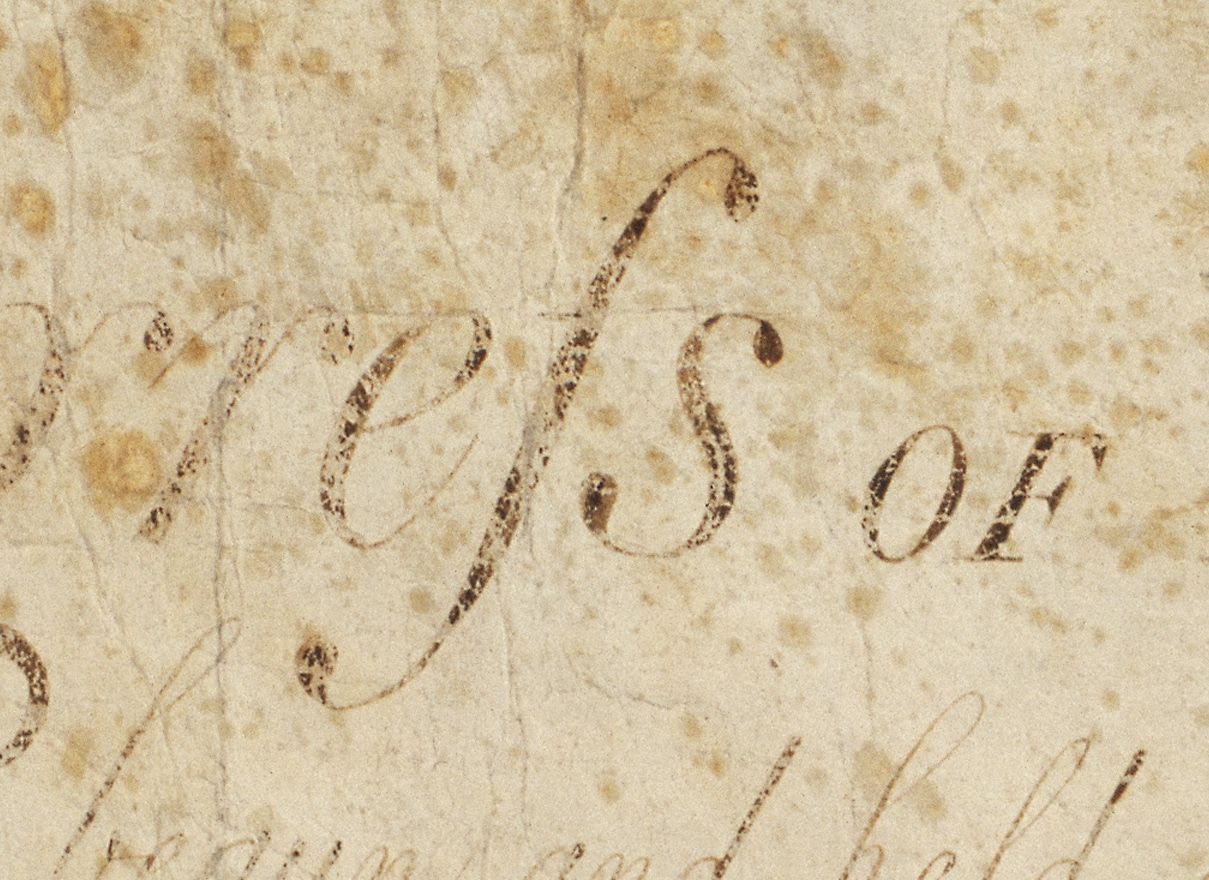 |
| An italicized ‘ſ ’ and ‘s’ found in the US Bill of Rights (courtesy of Wikimedia Commons) |

Blobbed letters ( x k )
The letter ‘x’ is composed of a heavy diagonal stroke crossed by a hairline upstroke. The diagonal is something like a backslanted ‘i’. The upstroke is capped by two short blob terminals meant to provide balance to the heavy diagonal. Calligraphically the blobs are written similarly to the terminals on the ‘f ’ (but in a single motion, since the hairline is written from bottom to top), so they should resemble them somewhat.

The letter ‘k’ is related to the ‘x’ just as it is in the roman. The arm and leg of the ‘k’ is a stretched version of the right side of the ‘x’; the stem is a typical stem, except it lacks an outstroke serif (the ‘k’ just looks weird with the outstroke serif).

The letter y
The italic ‘y’ is one of the most poorly defined letters in the italic alphabet, and so you have a great deal of creative freedom in designing this character. Some typefaces give the ‘y’ a unique form, others treat it like a ‘v’ with a tail, and still others render it as an ‘x’ with an elongated hairline and shortened diagonal. Some typefaces render the ‘y’ in its cursive form, a combination of the bowl of the ‘u’ and the tail of the ‘g’.

There is not much correlation between ‘y’ style and typeface era, though the curled fork form is generally used in very old style typefaces. The most popular form is the hard fork or “ ‘v’ with tail” form.
 |
| Inflorescence’s cursive ‘y’ |
The letter t
The ‘t’ is practically machine-slantable. However the angle of its stem cut (its sloped top) might be informed by the angle of the serifless legs of letters like ‘n’. The hook on its bottom is also optically similar to the finial on the ‘c’.

The letter z
The letter ‘z’ is a true italic outlier. It has absolutely no relation to any other italic letter; it must be drawn independently.

That concludes the italic lowercase alphabet! In the next few posts, we’ll go over how to italicize the capitals and symbols, which is generally a fairly straightforward process with few radical changes in glyph form.